Descanso
Industry
Bedding & Furniture
Services Provided
Branding
Web Design
Social Media
Descanso is a home décor brand that was started in Heidelberg. The product line was from pillows to everything necessary for a house to become a home. Descanso also had a greater motive to protect nature so their product was made of recycled plastic. So, the challenge was to put forward the cause of the company to people and make them feel they can also provide something to save nature. On the other hand, people have a confusion regarding the comfort the pillows or other products can provide. So, the challenge other challenge was to make people believe in the comfort of the product. For this branding website logo and strategy should be unique and people should feel comfortable while seeing the digital assets of the company.
It was a unique experience while working for Descanso. The market research was done as the market for home décor was Red Ocean as giants are swimming in the ocean. For this project, Enkreo worked round the clock for making the design, logo, and website. Enkreo also had a team of Psychologists to understand the market and human behavior for buying the product.
Branding
The branding of descanso was a new experience for Team Enkreo as people should feel the tranquility. The color-themed was chosen to solidify the idea and vision which Descanso has put forward for society. Logo was designed from the scratch and we kept the logo minimal so it can give people a soothing experience. Enkreo has always tried to keep give a calm soothing experience in the logo. Pictures used for the branding were more related to the family. As we think the home is the place where people find happiness and peace.


Web Design
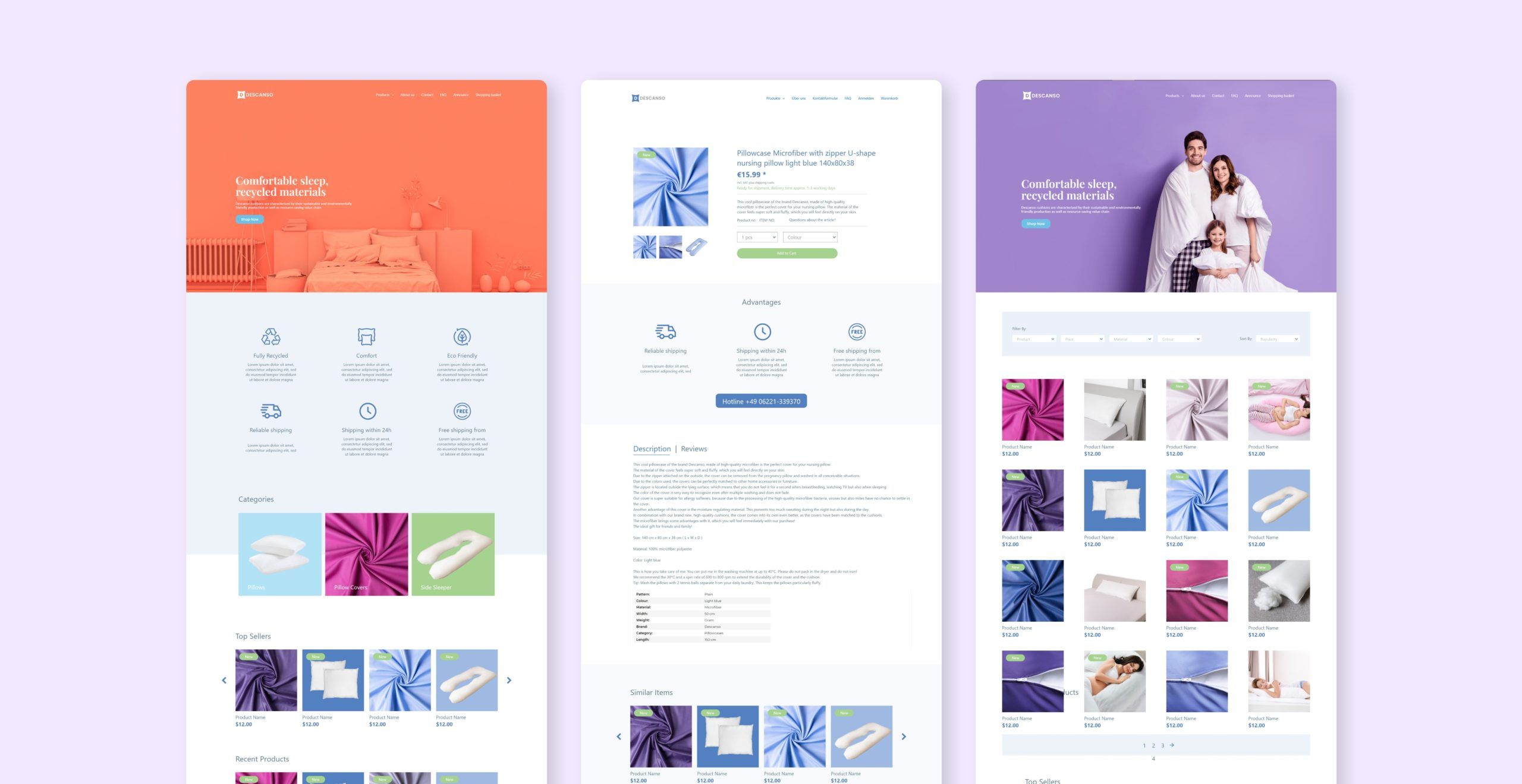
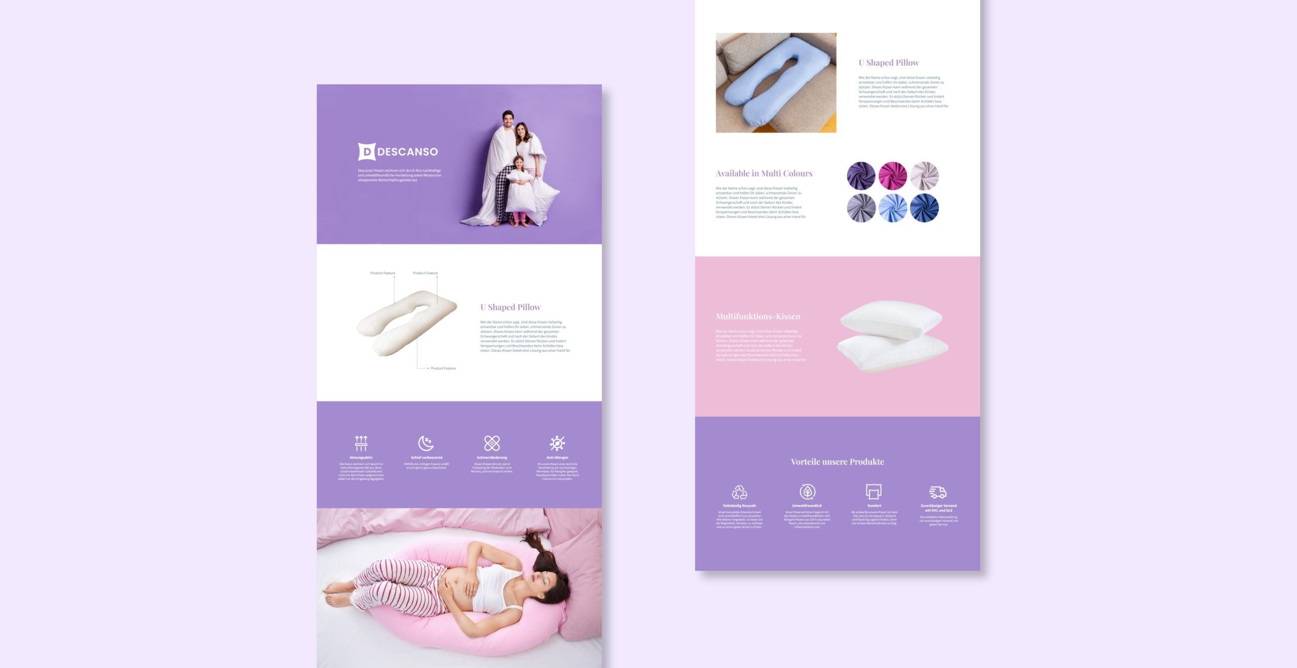
The website was also designed with a minimal design concept, so people can easily navigate through the website and they can find what they want with minimal effort. The payment methods are designed simply so the customers can have a better experience. Eyecatching banners and better product descriptions help to reduce the bounce rate on the website, thus making the website more user–friendly. We have also worked on the speed of the website as people don’t want to waste more time loading the website. Enkreo has kept room for new products and segments on the website.
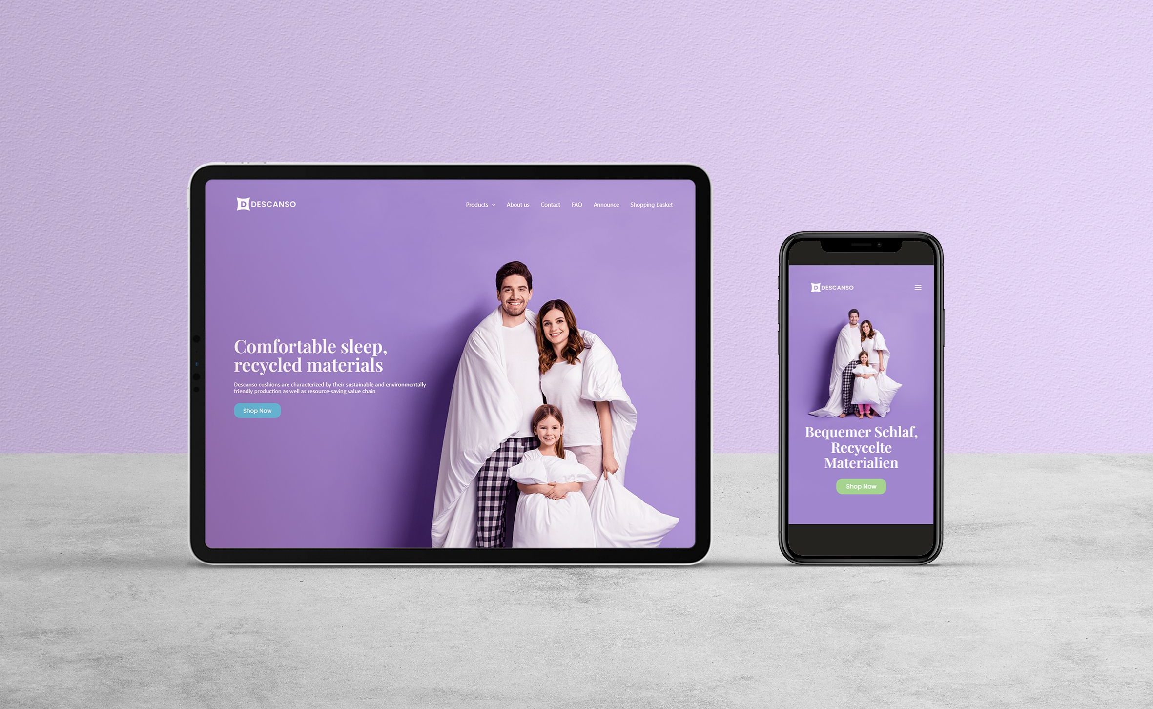
The design was also converted to make it responsive for mobile and other devices. Mobile Interface was really important as many users were shopping through mobile apps. CMS like WordPress helps in creating a responsive system that works on many devices. I was also careful in maintaining consistency in the brand elements, colours, and typography when It was adapted to different screens.
Social Media
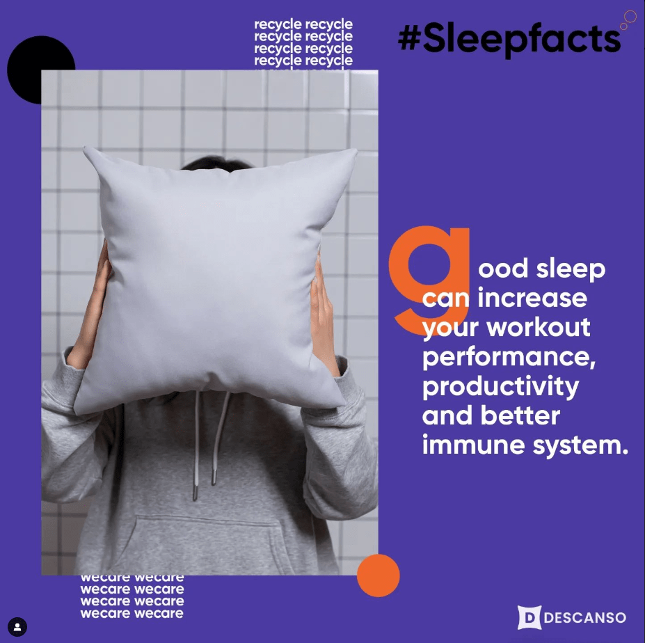
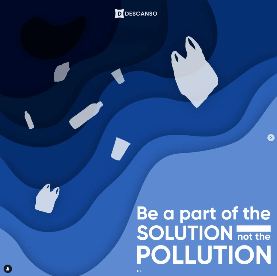
The team works for understanding people‘s concept, need, and want to feel. With this research, our expert design team made social media post that was eye–catching. The focus was set on plastic recycling, thus people have a feeling that they are contributing to the well-being of nature. The social media team has always tried to tell a story about how the ocean is suffering from plastic. And the social media posts have the same color tone and font size as the website thus making people feel they have continuity in the story of what we have to say. Yes, we were showing the experience rather than focusing on the sales. And this experience has always brought the customers to us!!!!!

Amazon Content
Enkreo also helped Descanso to make their print in online selling platforms such as Amazon. We designed the A+ content and managed the Amazon store. We also did Amazon keyword research so that people could easily find Descanso. Videos and photos were also taken by us to keep the unique brand identity. Banners are being designed to keep Amazon standards and uphold the value that Descanso is putting forward. The expert team of market research was there to study the trends in Amazon and execute the plan for the upscaling of the products in the Amazon Marketplace.
Iconography
A set of new Icons was specially tailored forthe brand to represent various services andadvantages of the products. It was designed toperfectly allign with the new brand character.Most of the Icons had a rounded edges and the thickness was maintained consitently on all the Icons. I am also planning to animate a few of them in the future so that It could be more interactive for the users.


