System 25
Industry
Technology
Services Provided
Branding
Social Media
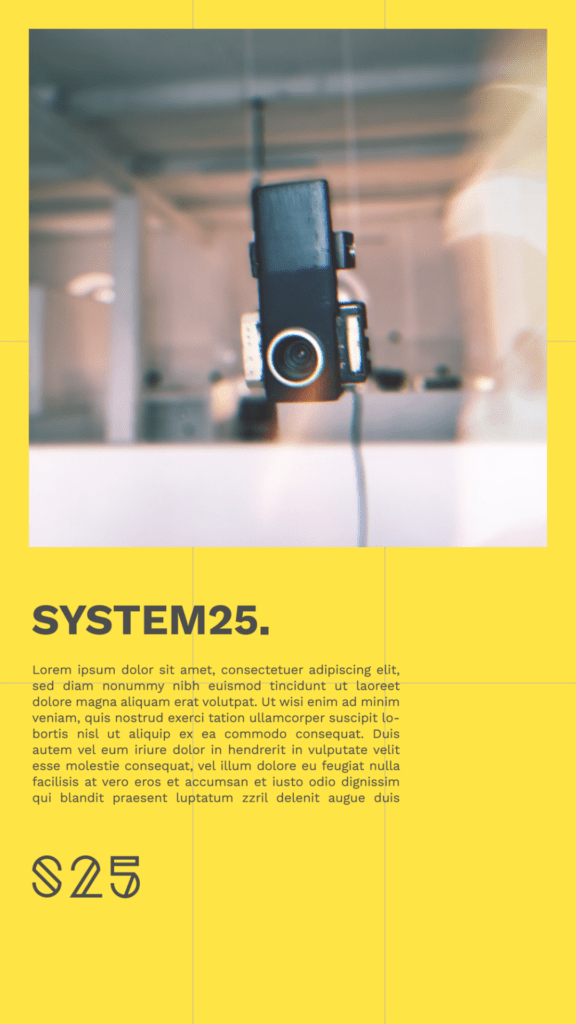
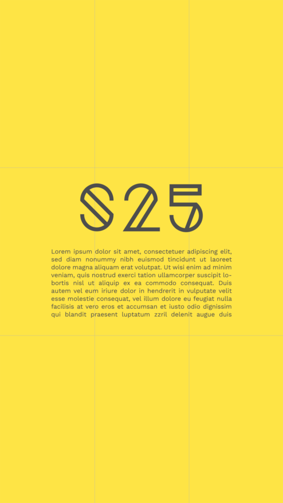
System25 is an organization that collects retro products and focuses on promoting the history of old tech systems that shape the world we see today. The subtle yellow with the linear geometry of the logo and strong typography gives a unique retro touch to the brand. The identity was designed through grids and off-centered elements. The logo is a combination of the numbers with the monograms, thus making the name much more memorable. The logo is designed in a minimal and tech-oriented manner. The combination of yellow, black and grey gives out a retro tech feeling and at the same time preserves the modern nature of the brand.
Branding
Grid plays an important role in the branding of System 25. Infact the grids are actually made visible on the branding materials so that it looks more organized and clean. The grids actually becomes like a pattern on many brand elements. We have used source sans pro as the main font to support the logo mark. Yellow, Black and Grey are used as the primary colours. Yellow is also a colour that stands out in both the digital and physical world, It is a colour that screams attention, when it is combined with the right typography and brand elements it creates a unique visual aesthetic.


Social Media
Social media marketing was important for System 25 for reaching out to people with similar interests and to create a new digital culture. The idea was to combine the rigid character of retro gadgets with a subtle brand identity to showcase them in a minimal manner both in a digital and physical manner. It was really hard at first to find the right elements to fit the retro character to a modern outlook, but the outcome of this experiment was a beautiful composition of color, typography, and retro images.
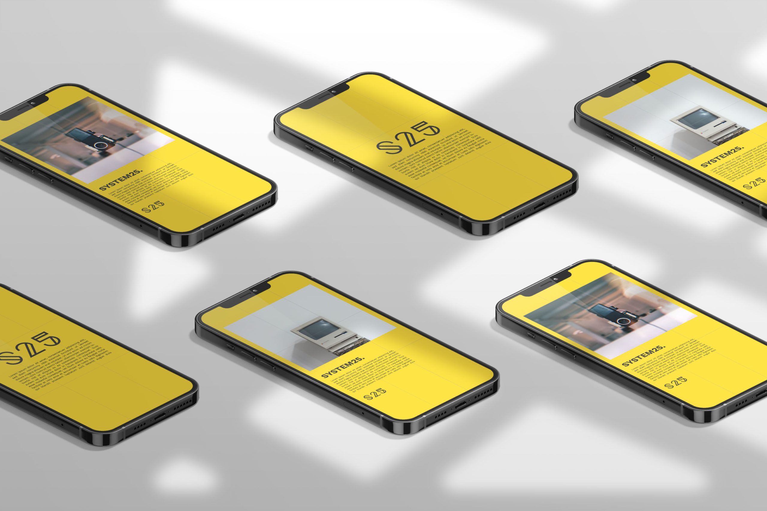
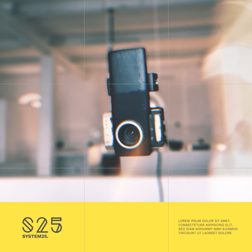
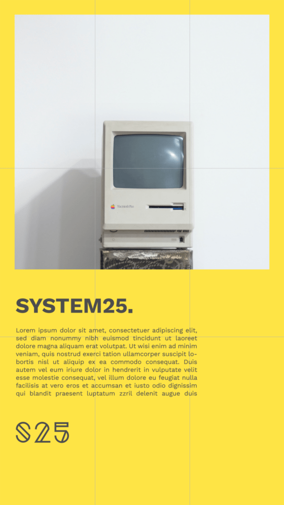
The buttons on google ads are grey, which is really different from the usual high-contrast colors we use to exert pressure on the user. We wanted to analyze and research the outcomes of such subtle colors on call-to-action segments, to see If the users are visually more comfortable and If so whether there was a drop in conversion rates just because of a dull color profile. Show above is a mockup of the social media system we designed for various platforms like Instagram, Linked In and Facebook.
The buttons on google ads are grey, which is really different from the usual high-contrast colors we use to exert pressure on the user. We wanted to analyze and research the outcomes of such subtle colors on call-to-action segments, to see If the users are visually more comfortable and If so whether there was a drop in conversion rates just because of a dull color profile. Show above is a mockup of the social media system we designed for various platforms like Instagram, Linked In and Facebook.
